A blog by Andy Pearson
1st May 2017 at 16:19
Rebooted
Around six weeks ago I was chatting to Rachel about the "old days" of web development. At one point in the conversation I described the tradition of the May 1st Reboot.
It had been a long time since I'd thought about the reboot but when I first started learning web development it was an exciting occasion that I awaited eagerly each year.
I've taken part in the reboot twice previously, and on both occasions it had been a positive double whammy:
- It provides a hard deadline to aim for which results in more focus than I can usually muster for a personal project
- Once the work is done and your own project is out of the door you can explore all of the amazing things that people have been working on at the same time
A teeny rush of nostalgia led me to look up the reboot to see if it was still a thing.
As you may have guessed already; it's still a thing! There's a site and an (obligatory) hashtag.
This version of Critical Zero has been lying around for almost two years and I've been talking about a new version for even longer. For old times' sake, I decided to knuckle down and finally get the site finished and online for May 1st. And, if you're reading this, everything went to plan!
Visually
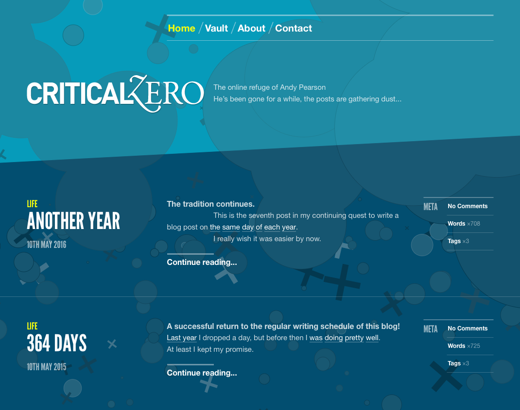
When I launched the old design (shown below) it was easily the best version of the site that I had ever made. A really strict grid, striking colour scheme, strong typography and a dash of generative art.
Once I fell into my annual post pattern, each year I'd return to the site less fond of it than the year before. There's nothing wrong with the design, really. I guess I just grew out of it.
It was also built during the simpler times of 1024×768 so anyone reading it on a small screen device would be having a bad time.
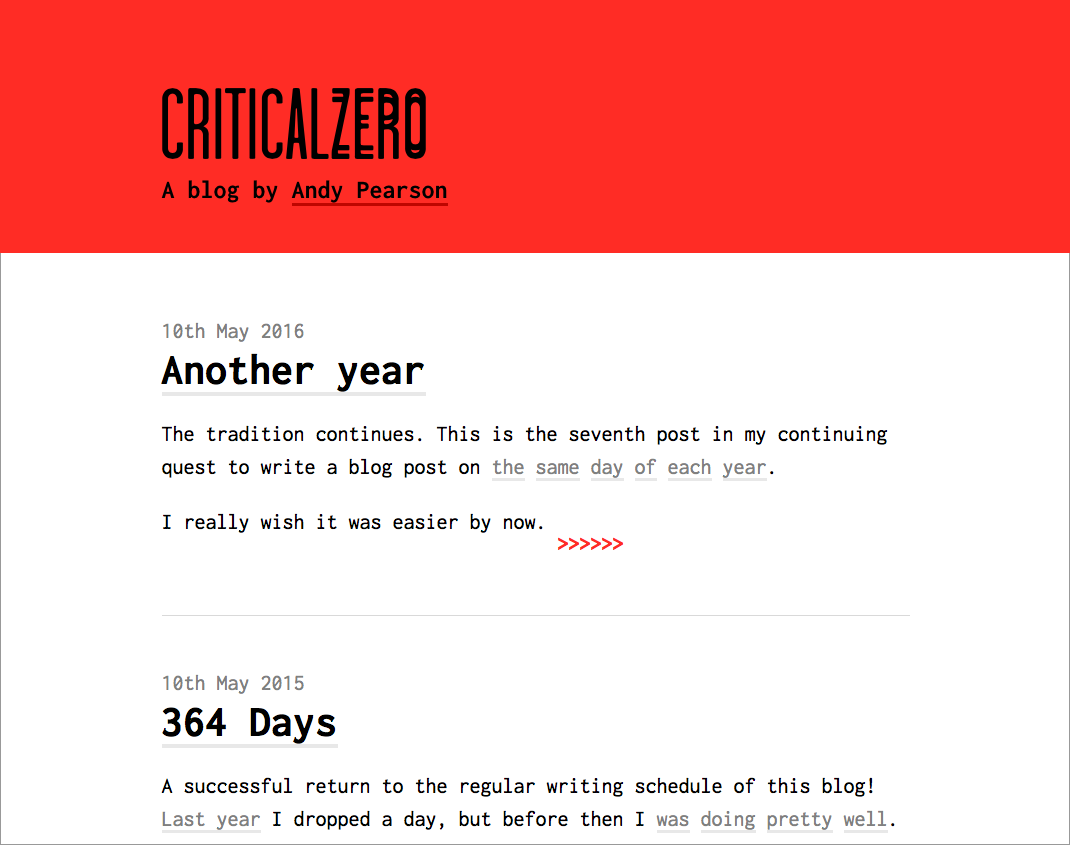
In contrast, my main aim for the new site was to keep things simple and produce a lightweight design that was easy to read on any device. Then I got a bit obsessed with ASCII and all of a sudden I was using Inconsolata for body copy. You can't win 'em all.
I put together a logotype from an idea I had ages ago that mimicked the "one word bold, one word light" style but used "doubled-up" letters for one of the words.
I picked the sourest red I could find and then spaced things out until I was happy.
Before (April 2017)
After (May 2017)
Technically
As is my tendency the site is heavily over engineered; a custom Rails CMS with no database. Posts are stored as TextBundles, a basically unused format that I stumbled across and really liked. I wrote a gem for reading and writing TextBundles called Trundle.
The OVH VPS was provisioned using Ansible and the site deployed using good ol' Capistrano. The SSL certificate is generated using letsencrypt.
There's very little CSS (written in SCSS), and no JavaScript, not even Google Analytics. Assets are built using Gulp.
Stupidly, the server runs the Dropbox daemon. Any changes I make locally/on the server are synced to a shared Dropbox folder. It seemed like a cool idea at the time.
Historically
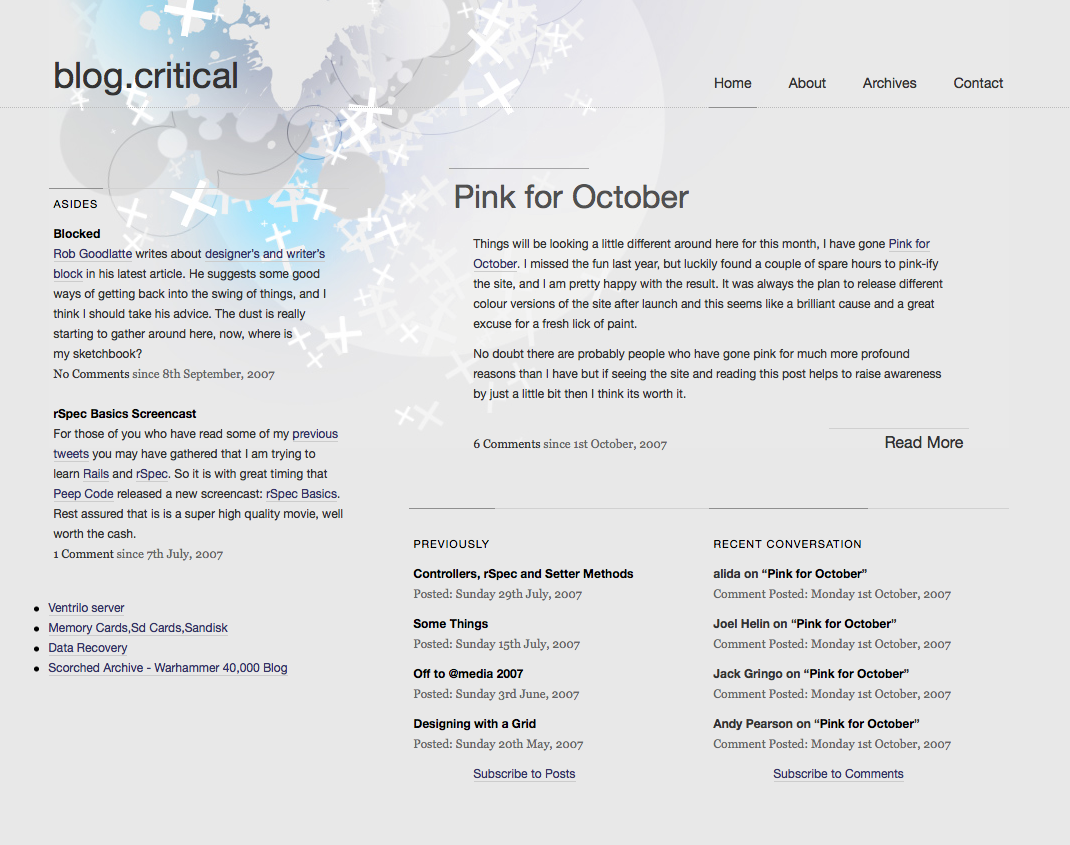
I figured it'd be interesting to see exactly how long it had been since my last reboot. Thankfully the Wayback Machine has a good archive of a lot of my personal projects so I didn't have to go digging through old hard drives.
To my surprise it's been ten years since my last reboot!
Here's what the site was looking like a decade ago:
Finally
My annual blog post is due in under two weeks, and then after that, who knows? I can't say I'm excited about writing, but I am excited to have finished such a long running project.


